
Background
We work with many large enterprise-scale organisations, helping them improve their vulnerability management processes. During those engagements, we see various common trends that are shared between them; one such commonality is how organisations want to visualise their security posture.
In this blog post, I will go through the different user profiles that organisations have, along with the data shown to each of those profiles.
Before moving on, it is probably worth dwelling for a moment on the large volumes of data being handled. With the average server having 100 vulnerabilities of varying severity, and with, say, 10,000 servers, that makes 1 million vulnerabilities to keep track of. That must be correlated with the application vulnerabilities and other data sources, to enable the user to see the critical details. Add to that information on another 50,000 workstations with their software inventories, and we are talking serious amounts of data. This is hard work for a database to do quickly, so think hard about how you will do this, see 8 best practice steps for vulnerability management for more discussion on the subject.
One quick note of predentary, when I refer to “vulnerability” in this blog, I have an expansive definition that covers all security issues, including CVEs, CWEs, miss-configurations, policy violations and so on.
Looking for a demo? Get in touch today for more information.
Why dashboards for vulnerability data?
With the volumes of data being managed, it is not possible to load it into Excel and look through it. The consumer of the information needs tools to find the important bits. That is why we recommend using dashboards.
When done well, a dashboard is a great way of providing data to users. Done badly, they confuse and even mislead.
Much has been written on this, but we like to use 3 tests for a good dashboard:
- Obvious – I can look at my car dashboard and in 1 second, get the many pieces of information I need. Speed, revs, petrol etc. a red oil light means “stop everything and investigate now”. Vulnerability dashboards should be the same.
- Relevant – information for people who do my job or me.
- Active – I need more information, so click to drill through to the next level of detail.
Key Profiles
In talking with our customers, there are 3 job roles that consume the vulnerability data:
- The CISO
- The vulnerability management team
- The patching teams / IT department
The board may also want vulnerability information, but we typically see that as a subset of the CISO data. Some companies have slightly different structures, but they all seem to fall into one of the above categories.
Below we have a “sub-profile” of a special projects team. We see these get created occasionally in response to the changing threat environment to deal with a specific issue.
I will dwell on each one in turn and provide some screenshot samples using Brinqa (a tool that we sell to help address this and other issues)
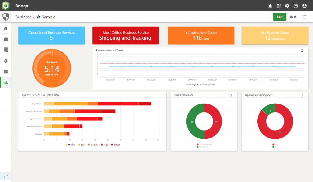
CISO
We find the CISOs tend to be interested in the direction of travel (things getting better or worse), plus using their seniority and influence to encourage departments that are not doing as well as their peers to improve.
We generally see that they want:
- Watch trends over time
- Track against SLA
- Which departments are doing best
Here is a sample dashboard built for a CISO at one of our customers with test data.
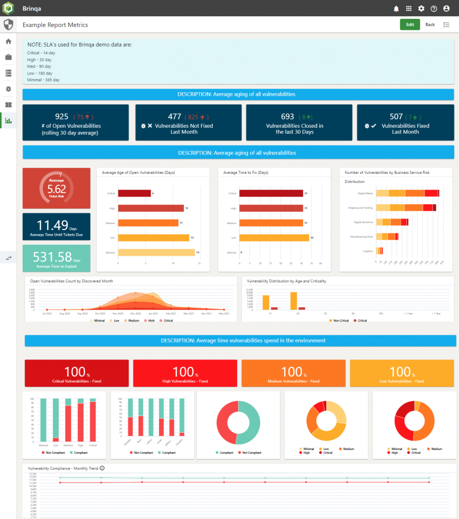
The Vulnerability Team
These guys swing from worrying about trends (just like their boss), to fighting with emergencies which seem to crop up with ever-increasing regularity.
About every quarter, there is a “red oil light” situation, where they have to drop everything and ensure patching of a specific item is done pretty much immediately. In the last few years, remember: Eternal Blue (Wannacry), Blue Keep, Boothole, Zero Logon, the entire Solar Winds debacle, and Microsoft Exchange’s Proxy Logon (Server-Side Request Forgery/SSRF), to name but a few. All of these demanded lots of running around, shouting and immediate attention.
The trend data for these people is also a bit more operational than the CISO.
- Time series for operational data things like vulnerabilities opened / closed per week.
- Top 10 most vulnerable machines, websites, technologies
- Watch CVE-2021-26855 over time, understanding that the CVE number will change to reflect current trends.
Here is a link to a sample dashboard built for one of our customers with test data.
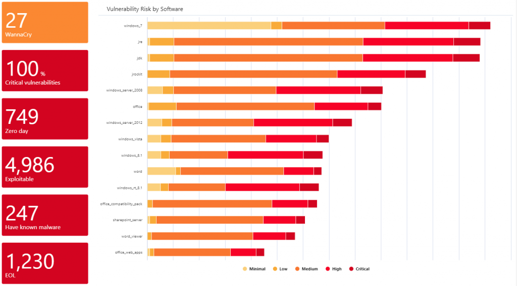
Special Projects
This team may also have project-based work, and need the information to support this. We have worked with customers to do many things; I think my favourite was the “Quick Wins” screen; this shows which products contribute the most to the organisation’s vulnerability score. Historically this was Flash Player [no surprise] and then Java [again no surprises], but this has evolved and varies significantly from place to place. The outcome from this was often not so much patching, as uninstalling. Users just don’t need WinZIP anymore!!
Again, here is a sample dashboard.
Patching Team
This is all about operational data, what needs to be done, and when and how. We also find that adding some metrics for the individual that can be used for comparison also increases the team’s performance.
On the operational data front, we suggest the following:
- Tickets close to SLA
- Most vulnerable machines within my responsibility
- Machines with CVSS > 9 vulnerabilities on
Then on the comparison front:
- Rolling 30-day average of time to fix for high severity vulnerabilities; user vs others in their team
- How many machines does the user have tickets for that are in the top 10 most vulnerable report shown to others
Here is a link to a sample dashboard built for one of our customers with test data:
Bigger than it initially looks …
This article is part of a 4-article series, all looking at different parts of the same problem. Here we have focused on one area and neatly skipped over some other rather complex issues.
We see the 4 key pillars of a complete vulnerability solution encompassing the following high-level functionality:
Prioritisation of issues – No organisation, not even the best, ever gets rid of all their security issues, but they do make an effort to create a complete list of them, and then fix the worst ones. And there is the challenge, what are the “worst ones”? This sounds simple, but is deceptively hard.
Integration of data – Saying “connect to my DAST tool and extract the data” is much easier to write than to implement, as is aligning data from DAST, SAST and network scans into a single, browsable data set that allows you to navigate from application, to server to vulnerability and so on.
Visualisation and dashboard reporting – discussed in this blog
Automation – IT Security people are expensive, so you want to use this valuable resource as sparingly as possible. Automation removes people from most of the process, allowing them to focus on what really matters and allowing the machine to make the remaining decisions.
You will find that we discuss all 4 items in the article on Vulnerability Management Program.
Security vendors don’t help
The security product vendors all have a reasonable idea of the above and are all building a suite of tools to address parts of the problem. The issue is that most vendors have one good tool and a bunch of mediocre tools that tag along.
If I look at Qualys (I am not picking on them, insert Tenable, Rapid7 etc., they are all the same), their network scanning tool is genuinely market-leading. The other 20+ that they have range from “ok” to “hmm, not bad”. They exist together to meet a sales objective of “we need more products to sell to our existing customers”.
Be wary of vendor lock-in business models.
Several years ago, software vendors would sell a perpetual license to their software; this was expensive in year 1, but less so in year 2+. This created a degree of vendor lock-in, because if you wanted to move, then you had to pay that big up-front fee again.
The vendors then worked out that they could make more money by selling annual subscriptions (which is where everyone now is). This has the advantage that, as a user, you can switch if a vendor falls behind the market or gets too aggressive with their pricing.
This burned a number of vendors, so they now look for other ways to generate lock-in. One of those is selling a set of loosely connected, mediocre tools. That makes it much harder to get rid of them all. Also, should you decide to remove one tool, they may put the pricing up on the others as a disincentive.
We generally recommend buying best-of-breed technologies and reviewing the situation every 2 to 3 years to ensure that you have the best technology at the best price.
Next Steps
- Build tools yourself using existing integration frameworks / data warehouse tools.
- Give us a call to see a packaged solution that covers the entire problem.
- What is security maturity, and how can S4 Applications help you enhance your security posture?
- Read our blog: Assess your security Posture with our Security Maturity Model.